Pyplot - Data Visualization
Intro to pyplot
matplotlib.pyplot is a collection of command style functions that make matplotlib work like MATLAB. Each pyplot function makes some change to a figure: e.g., creates a figure, creates a plotting area in a figure, plots some lines in a plotting area, decorates the plot with labels, etc.
In matplotlib.pyplot various states are preserved across function calls, so that it keeps track of things like the current figure and plotting area, and the plotting functions are directed to the current axes (please note that “axes” here and in most places in the documentation refers to the axes part of a figure and not the strict mathematical term for more than one axis).
# Let's import modules what we will be using
# Through out the tutorial
import matplotlib.pyplot as plt
import numpy as np
plt.plot([2, 4, 8, 16])
plt.show()
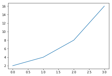
You may be wondering why the x-axis ranges from 0-3 and the y-axis from 1-16. If you provide a single list or array to the plot() command, matplotlib assumes it is a sequence of y values, and automatically generates the x values for you. Since python ranges start with 0, the default x vector has the same length as y but starts with 0. Hence the x data are [0,1,2,3].
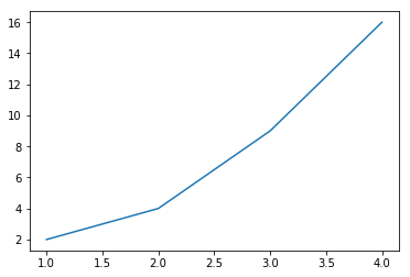
plot() is a versatile command, and will take an arbitrary number of arguments. For example, to plot x versus y, you can issue the command:
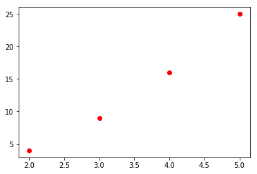
plt.plot([1, 2, 3, 4], [2, 4, 9, 16]);
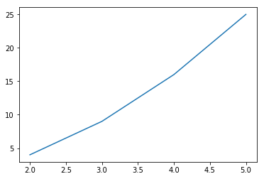
Your can define your x and y value first and pass to plot() function
x = np.arange(2, 6)
y = x**2
plt.plot(x,y);
Formatting the style of your plot
For every x, y pair of arguments, there is an optional third argument which is the format string that indicates the color and line type of the plot. The letters and symbols of the format string are from MATLAB, and you concatenate a color string with a line style string. The default format string is ‘b-‘, which is a solid blue line. For example, to plot the above with red circles, you would issue
plt.plot(x, y, 'ro');
Remember from the past tutorial of Numpy array about linspace We can utilize it now.
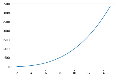
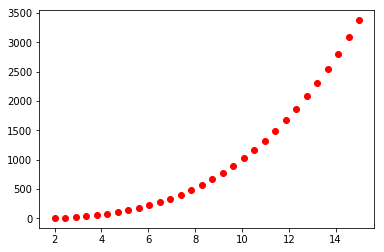
x = np.linspace(2, 15, 30)
y = x**3
plt.plot(x, y);
plt.plot(x, y, 'ro');
# We can use numpy logspace function as well.
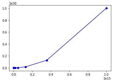
x = np.logspace(2, 15, 30)
y = x**2
plt.plot(x, y, 'bo-');
we can even pass multuple argues in our plot function. Let’s see, what i mean.
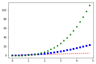
# evenly sampled time at 200ms intervals
t = np.arange(0., 5., 0.2)

# red dashes, blue squares and green triangles
plt.plot(t, t, 'r--', t, t**2, 'bs', t, t**3, 'g^')
plt.show()
Plotting with categorical variables
It is also possible to create a plot using categorical variables. Matplotlib allows you to pass categorical variables directly to many plotting functions. For example:
names = ['Australia', 'Asia', 'Africa']
values = [1, 10, 100]

plt.figure(1, figsize=(9,3))

plt.subplot(131)
plt.bar(names, values)

plt.subplot(132)
plt.scatter(names, values)

plt.subplot(133)
plt.plot(names, values)

plt.suptitle('Categorical Plotting')
plt.show()
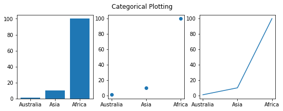
The subplot() command specifies numrows, numcols, plot_number where plot_number ranges from 1 to numrowsnumcols. The commas in the subplot command are optional if numrowsnumcols<10. So subplot(131) is identical to subplot(1, 3, 1).
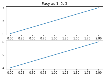
You can create multiple figures by using multiple figure() calls with an increasing figure number. Of course, each figure can contain as many axes and subplots as your heart desires:
plt.figure(1) # the first figure
plt.subplot(211) # the first subplot in the first figure
plt.plot([1, 2, 3])
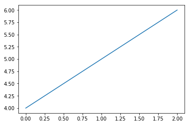
plt.subplot(212) # the second subplot in the first figure
plt.plot([4, 5, 6])
plt.figure(2) # a second figure
plt.plot([4, 5, 6]) # creates a subplot(111) by default
plt.figure(1) # figure 1 current; subplot(212) still current
plt.subplot(211) # make subplot(211) in figure1 current
plt.title('Easy as 1, 2, 3') # subplot 211 title
# Note: Ignore the above warning message
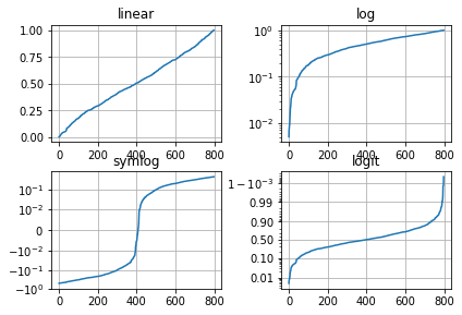
Logarithmic and other nonlinear axes
matplotlib.pyplot supports not only linear axis scales, but also logarithmic and logit scales. This is commonly used if data spans many orders of magnitude. Changing the scale of an axis is easy:
plt.xscale(‘log’) An example of four plots with the same data and different scales for the y axis is shown below.
from matplotlib.ticker import NullFormatter  # useful for `logit` scale

# Fixing random state for reproducibility
np.random.seed(19680801)

# make up some data in the interval ]0, 1[
y = np.random.normal(loc=0.5, scale=0.4, size=1000)
y = y[(y > 0) & (y < 1)]
y.sort()
x = np.arange(len(y))

# plot with various axes scales
plt.figure(1)

# linear
plt.subplot(221)
plt.plot(x, y)
plt.yscale('linear')
plt.title('linear')
plt.grid(True)


# log
plt.subplot(222)
plt.plot(x, y)
plt.yscale('log')
plt.title('log')
plt.grid(True)


# symmetric log
plt.subplot(223)
plt.plot(x, y - y.mean())
plt.yscale('symlog', linthreshy=0.01)
plt.title('symlog')
plt.grid(True)

# logit
plt.subplot(224)
plt.plot(x, y)
plt.yscale('logit')
plt.title('logit')
plt.grid(True)
# Format the minor tick labels of the y-axis into empty strings with
# `NullFormatter`, to avoid cumbering the axis with too many labels.
plt.gca().yaxis.set_minor_formatter(NullFormatter())
# Adjust the subplot layout, because the logit one may take more space
# than usual, due to y-tick labels like "1 - 10^{-3}"
plt.subplots_adjust(top=0.92, bottom=0.08, left=0.10, right=0.95, hspace=0.25,
                    wspace=0.35)

plt.show()
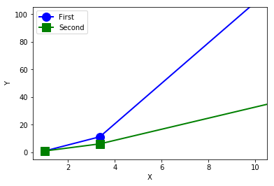
Extra Exercise
x = np.logspace(0, 10, 20)
y1 = x**2.0
y2 = x**1.5
plt.plot(x, y1, "bo-", linewidth=2, markersize=12, label="First")
plt.plot(x, y2, "gs-", linewidth=2, markersize=12, label="Second")
plt.xlabel("X")
plt.ylabel("Y")
plt.axis([0.5, 10.5, -5, 105])
plt.legend(loc="upper left")

# to save (will be saved in same directory you are working with)
# your figure as pdf.
plt.savefig("mylopt.pdf")
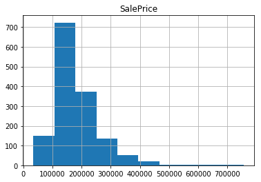
# to generate histogram
x = np.random.normal(size=1000)
plt.hist(x);
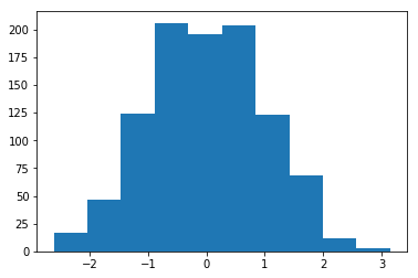
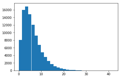
x = np.random.gamma(2, 3, 100000)
plt.hist(x, bins=30);